Wednesday, 19 February 2014

Shoot 5


Shoot 5


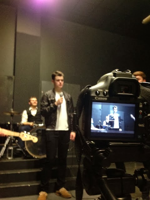
Shoot number 5 was the performance scene where we had different takes of the band singing or playing their instrument. From researching other bands in the same genre we found that nearly always that quite a lot of the video is performance based therefore we felt that it was essential that we included scenes of the band performing.

There was a lot of planning going into this shoot for example as the lead singer I had to learn the lines of the song which wasn't too hard considering that there are not many verses. Also a big part of planning was thinking of the location. Firstly we thought of filming it in the studio however we felt that our school studio doesn't look professional enough for an Indie Rock band therefore we had to look elsewhere. We found a drama room with all black walls and a small stage for our drum kit and when we played around with the lighting it looked perfect for what we wanted.

Also when planning we needed to think of how to get instruments as none of the group owned any. We asked the music department if we could borrow some equipment from them which included:

- Drum Kit
- Guitar
- Bass Guitar
- Microphone

This helped us out tremendously as without the instruments we would be unable to shoot the whole performance scene. However, none of us in the group can play an instrument therefore filming someone playing the drums when he can't actually play the drums is difficult. Therefore, we have to make sure we do quick cuts in the editing stage to make sure it looks convincing.

Overall, this session was successful as it was our first try at the performance and we didn't know what we were doing at the start but towards the end we overcome the problems and difficulties and next time we shoot this scene we should be able to start straight away without encountering problems.

Shoot 4

Shoot 4


Above are some photos take from our fourth shoot which was the scene which shows our main character training. The location in which this section was filmed was at Charlie's Grandparents shed in their garden. This location was effective as it already had the equipment that was needed and it shows the main character didn't have a fancy gym to train in had to do it the hard way. Also in this scene we plan to have a fade shot which it turns from a shot of the main character training and then turning into an older and more trained version of himself. Some of the shots that we took was Freddie (youngest actor) on the punch bag and working out doing press ups.  

When filming we attempted numerous amount of ways to portray that Freddie was going to turn into Charlie. For example, we tried to have Freddie punching the bag then pan across so he was out of the shot and when we pan back it was Charlie on the punch bag instead. Even though this came out successful when shooting when editing, the transition was far too long therefore we felt it was best to do a fade into Charlie. We felt that it was important to include this because we wanted to let the audience know that Freddie and Charlie are the same character but at a different age. 

Overall, this shooting session was a success as we got plenty of different shots and takes and we don't feel like we need to revisit this scene.Before, arriving upon location we had our doubts about what it was going to look like as we didn't know how much space we had to work with inside the shed. However, even though it was tight we managed to shoot some good takes and I feel like this will look good in our music video. 


Tuesday, 4 February 2014

Shoot 3


Above are the photos taken from our shoot at our location in Crystal Palace park. After researching different parks and steps that we could use, as a group we felt that the Crystal Palace park steps were ideal for what we wanted to create. The idea for this scene was first instigated by the Rocky scene where he is running up the steps for training and it represents him getting to the top having been training for a while. We decided to shoot it very similar to the way Rocky shot the scene as it makes it an intertextual reference which is included in Andrew Goodwin's music video theory.The location that we chose was perfect as the steps were very wide which is important as it wouldn't look right with narrow steps.


However, when we arrived at the location we encountered some problems. Firstly, as we do not have access to the correct equipment we had to improvise for example when Rocky is running up the steps from a high angle it is from a very high vantage point and must have been a crane shot whereas we could only use a tripod. However, the scene was a success overall as we got all of it shot in one day and when edited it came together nicely and will look good in our music video.


Monday, 3 February 2014

Digipak Advert 2nd Draft


From the feedback I was given from my class I decided to do a second draft of my advert. I was advised that my first draft of my digipak advert didn't link with my actual digipak as one was all black and white and other was in colour and a few other differences made them too different and I had to make some changes to make them similar.  The first major change was the black and white, even though the first advert had very nice colours and I wanted to keep that because of that reason I decided to make the second draft black and white which has come out well. The black and white helps link the digipak and the advert together which is important because if you see the advert you will know what digipak to purchase as the design is the same.

The second change is the colour of the font from Black to a burgundy colour. I used this colour as it is consistent throughout my digipak and it would again informs the consumer that they are both linked and  makes it easier for it to be recognisable. However I encountered a problem when doing this as I felt that the words didn't stand out enough and got lost within the picture. Therefore, I added effects such as a stroke around the lettering and small subtle shadow which I felt worked really well as it made the words stand out from the image. However, I may have a problem with the audience reading the reviews as the stroke around the lettering may obscure the words from being readable.

Digipak 2nd draft


Above is my second draft of my Digipak. The noticeable changes are mainly the CDs as from my feedback I was advised to change and rethink my idea for the CDs. With consideration I decided to use images of iconic landmarks in London to again show where the band originated from and to show they are sticking to their roots. I made the images black and white and changed the brightness and contrast of the until I thought they were the best they could. be. 

Also anther thing which I have improved on my Digipak is the colour scheme. This is because before the red was bright and clashed with the black and white rather than compliment it which i was hoping for. This change was instigated from the feedback I received which I agree with.

Finally, I have also designed a raffle ticket. This was a long process as I wasn't happy with the designs I was making and it looked unprofessional. The raffle ticket above was one of the best I designed however I am still thinking on how I can improve it as I think it could be much better. My current train of thought is that i use an image of the band holding the code in their hands for example holding some sort of board or paper and I can edit the codes on in Photoshop.