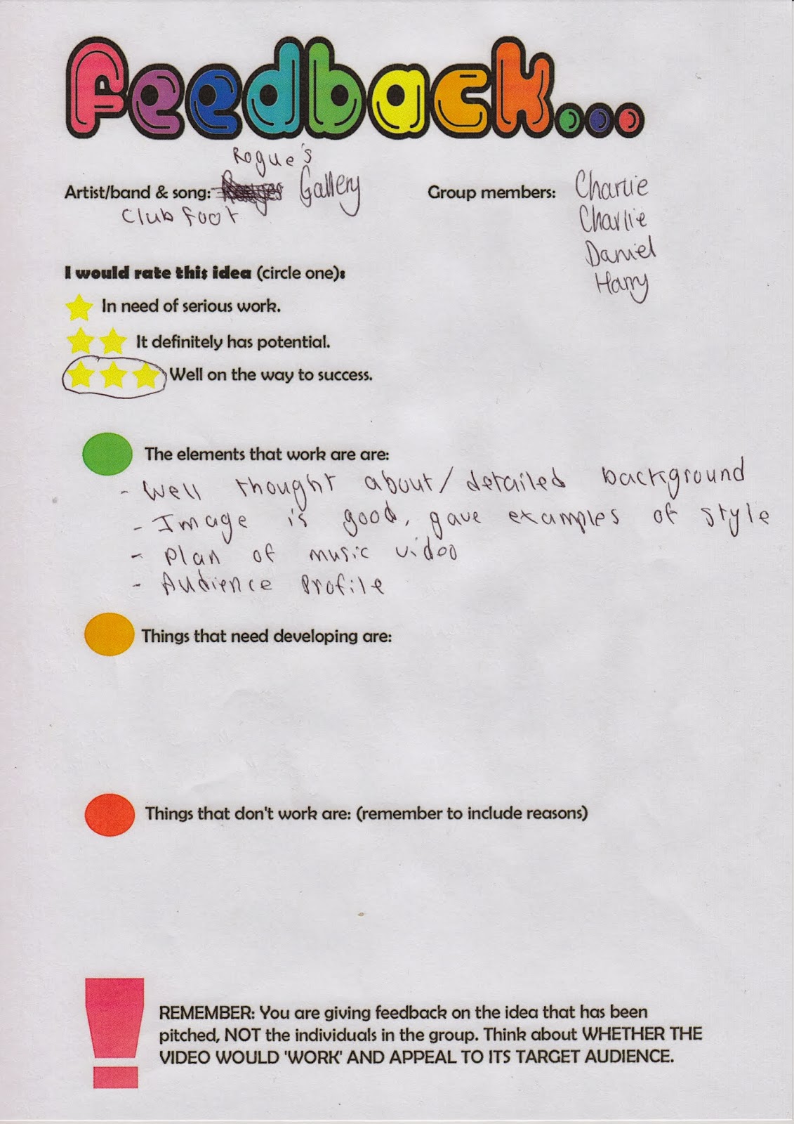
Wednesday 23 October 2013

Photo Shoot- In Studio


Music Video- Pitch


This was the pitch we conducted about our band. It shows the background of our band and where they came from. Also it shows what record label we have chosen that best fits our band, the characteristics of our band such as clothing and then we made a video about our music video idea. Finally we presented some of our audience research as we displayed graphs that we made. I feel this pitch went very well as we got across what we needed to and the audience understood what we was aiming for. We received good feedback from our class as they like dour idea however we need to make some improvements such as the band logo.

Music Video - feedback sheets

Feedback from Pitch

Overall, the feedback we received was really good as the class gave us many positives about  the music video such as our audience research and profiling and the plan of our music video. other positives included that we researched well into our band image and made sure we portray that because it is important if you look at a band you should be able to recognise their genre. Things that we may have to improve would be our band logo as some of class thought it was too 'prison' related and it felt like more grime/rap genre which we want to stay away from as we want to make sure we keep the indie theme throughout our whole piece. Therefore we are going to change our logo to something of the indie genre and research shows that indie bands usually have quite a simple font as their logo such as the Arctic Monkeys have a simple white font in a black background. Finally, we also need to improve on our application of Goodwin analysis as we need to take into consideration factors of the Goodwin analysis such as links between the music and visuals and lyrics and visuals.


Photoshoot- Against The Wall Edited Version


Photo shoot- Band Against Wall Original


Thursday 10 October 2013

Survey Results

Survey Results

These are the results from the online survey we conducted last week to find out information about which audiences we attract and what they like. Our results were mainly from the male genre which shows that the males are more interested in this kind of music. We also asked their age range which 16-18 and 19-25 dominated showing that we appeal to a young audience. From this we asked different questions such as 'what genre would you relate to our band name- Rogues Gallery' of which the results were mostly indie rock and rock genre. Also we asked the audience about our music video as we asked them to listen to the song and imagine what the music video would be like which most said about an action scene or a fight scene which we will take into consideration and may apply to our ideas. Finally we asked more questions about our appearance which most said skinny jeans and leather jackets which we were thinking of anyway as it is the stereotypical indie rock band appearance.


Monday 7 October 2013

Survey

Click here to take survey
This is part of our audience research of which we have created an online survey which people have easy access to. This will help us as it can reach a wider range of people giving us better results. The questions will help us with a number of things such as our band name and band image.

Saturday 5 October 2013

Change of Logo


Change Of Logo

From the feedback we was given we have chosen to change our previous logo. This is because the logo reminded the audience to much of the grime/rap genre due to the prison bars and knuckles which you can argue to be stereotypical of that genre. Therefore, I researched more examples of Indie Rock band logos as seen below. I found that they use simple fonts and have a black and white theme throughout all of them.

Therefore, I am going to use http://www.dafont.com/  to choose a selection of fonts that fit the Indie Rock genre. Then either as a group come tom a decision on which font to use or conduct some audience research on which font they prefer.


Thursday 3 October 2013

Audience Profile


Script for Kasabian Empire Analysis


Kasabian- Empire analysis script

The digipak I have chosen to analyse is Kasabians’ Empire this is because Kasabian is similar to our band. Empire is the second album by British indie rock band, released in August 2006. The album went onto No. 1 in the UK Albums Chart.


Throughout the digipak, a yellow colour scheme is used in order to make it look "old" as the main images are related with older periods of time, along with tradition black is used for the fonts. The other colours used are not as dominant and seem to appear on the "king" character - this could be to emphasise him. The colour red is quite strong as the banner declaring the name of the album "Empire" is in this colour.

The digipak contains the album disc, along with an additional DVD. The DVD shows music videos from the album, and extras such as songs from the bands next album. Having this additional information allows for the customer to gain extra value for money and also feel more "involved" with the band as they will be hearing unheard tracks - which not many others will be able to hear. I believe this is a good idea and may encourage me to put in my digipak. Furthermore, the digipak involved hand drawn images of the members of the band with additional messages. This again allows for the buyer to feel important and "in touch" with the band, which will in turn, lead them to buying the digipak.

Finally, the main image throughout the "Empire” digipak by Kasabian is a playing card as seen by the K and the club symbol on the front. This can be linked to the title of the album “empire”.  Also inside the digipak there are hand drawn illustrations of the band, which again is another extra advantage of buying the digipak.